بيت ورد
01. To develop a brand
T
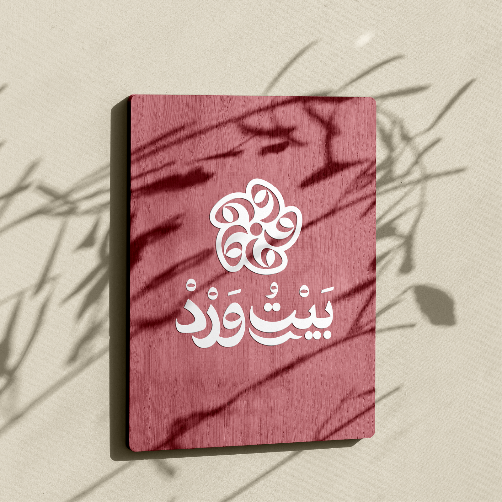
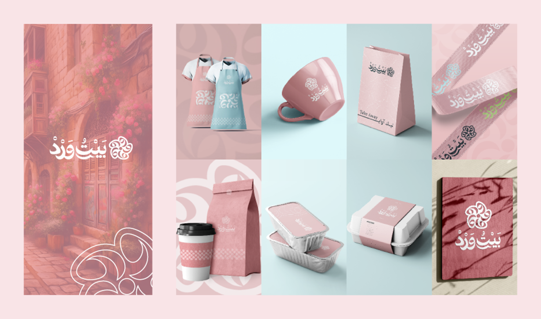
he logo includes a symbol representing a rose, surrounded by a design that reflects elegance and distinction.
The use of pink and white colors enhances the concept of “Beit Ward.”
02. Color Palette
Main Color:
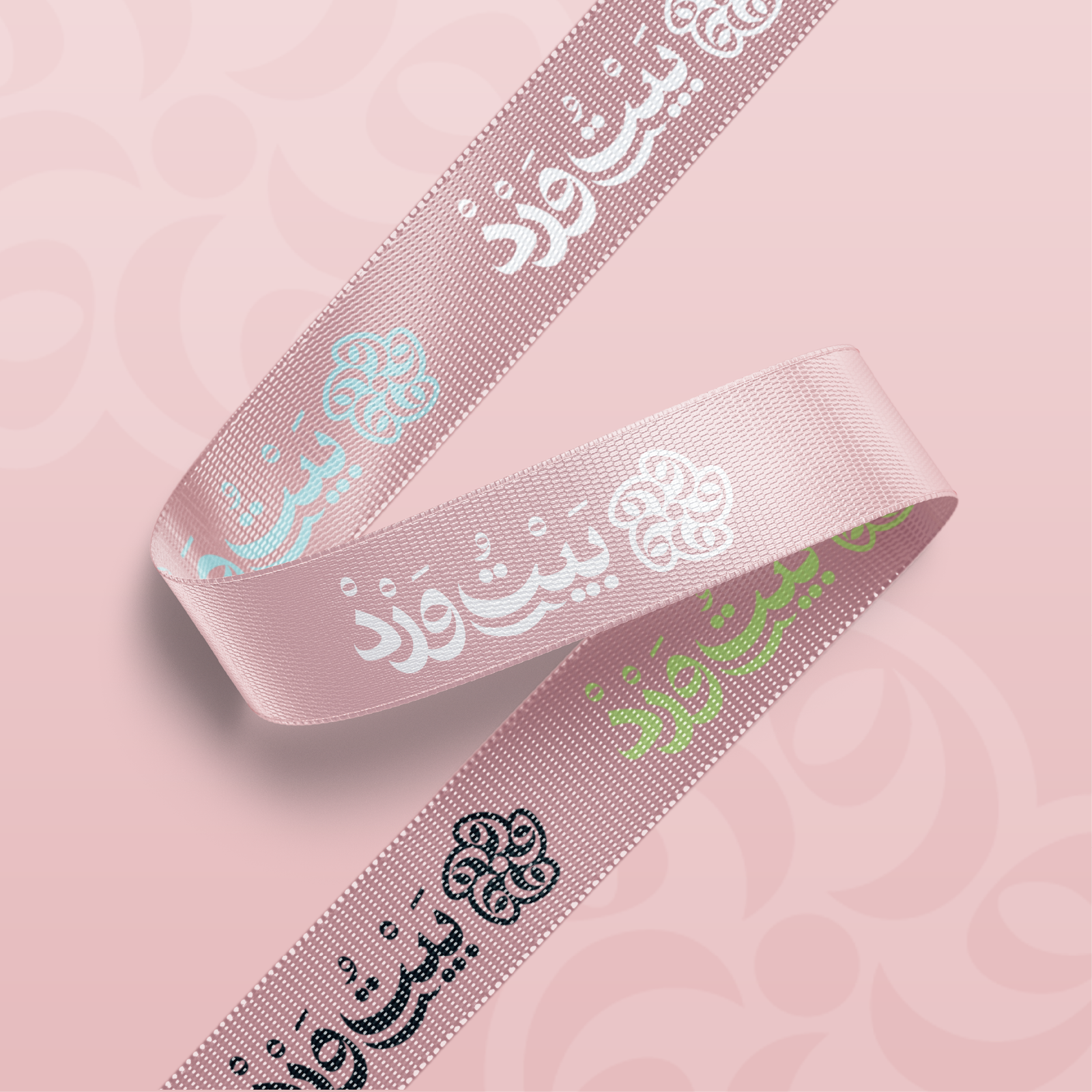
Light Pink:Reflects romance.
Secondary Colors:
Pure White:Symbolizes purity.
Green:Adds a sense of freshness and nature.
03. Typography:
Arabic Font:An attractive and easy-to-read font that highlights the traditional character.
English Font:A modern font with artistic touches, expressing innovation and contemporary style.
04. Visual Identity:
Interior Design:
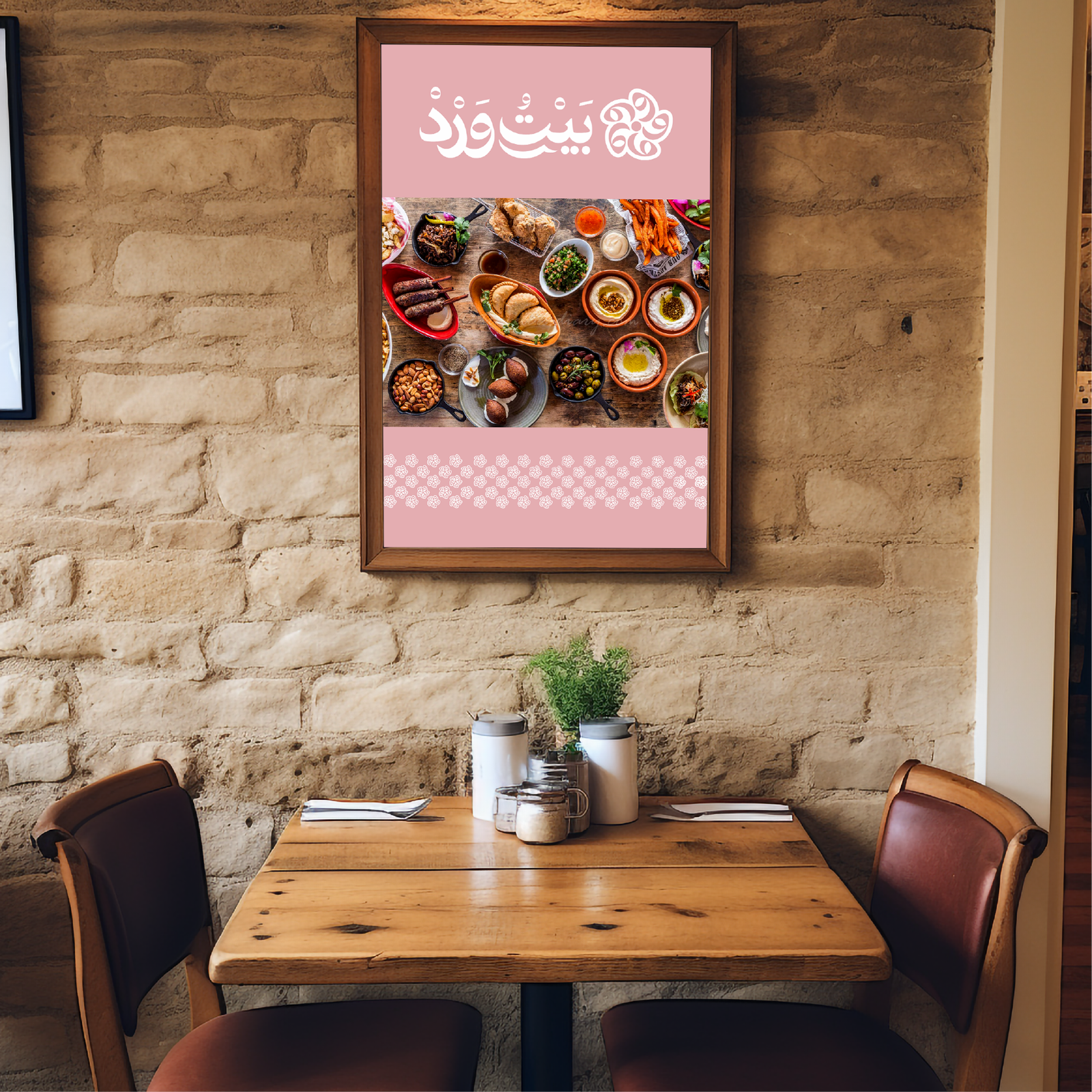
Warm and cozy ambiance, with soft lighting and floral decorations.
Comfortable furniture with natural touches.
Visual Elements Design:
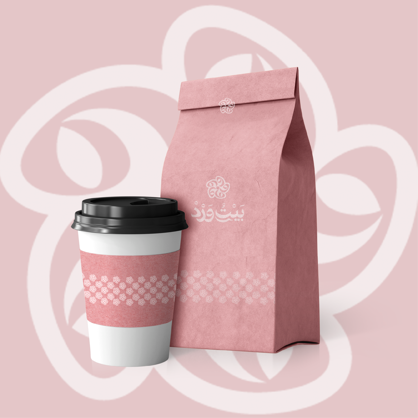
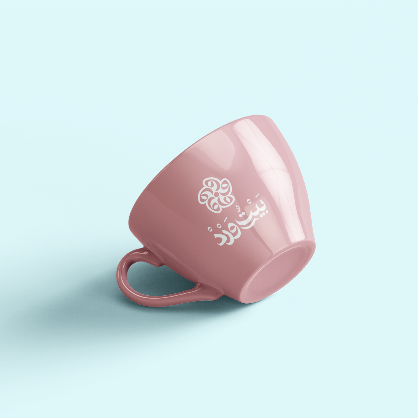
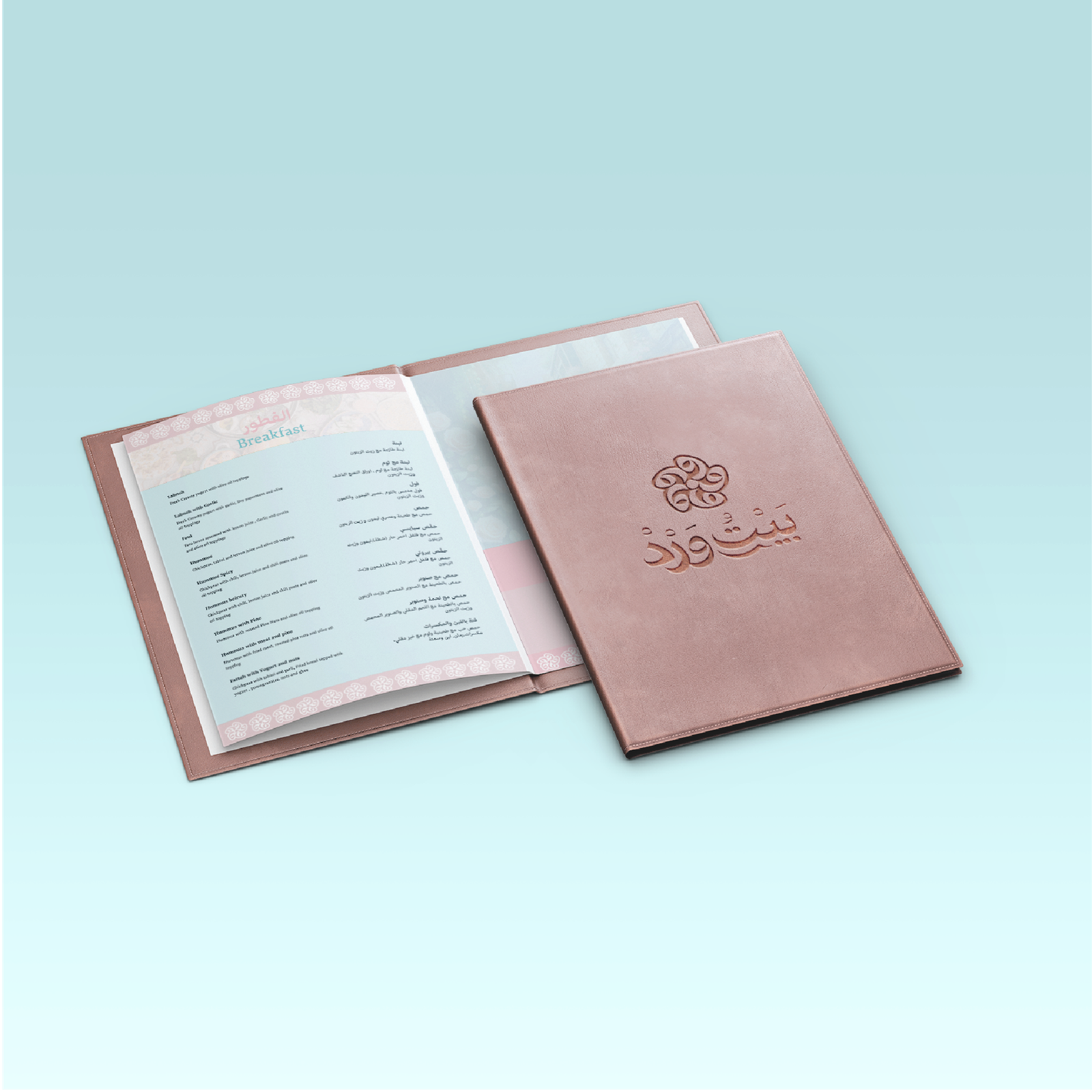
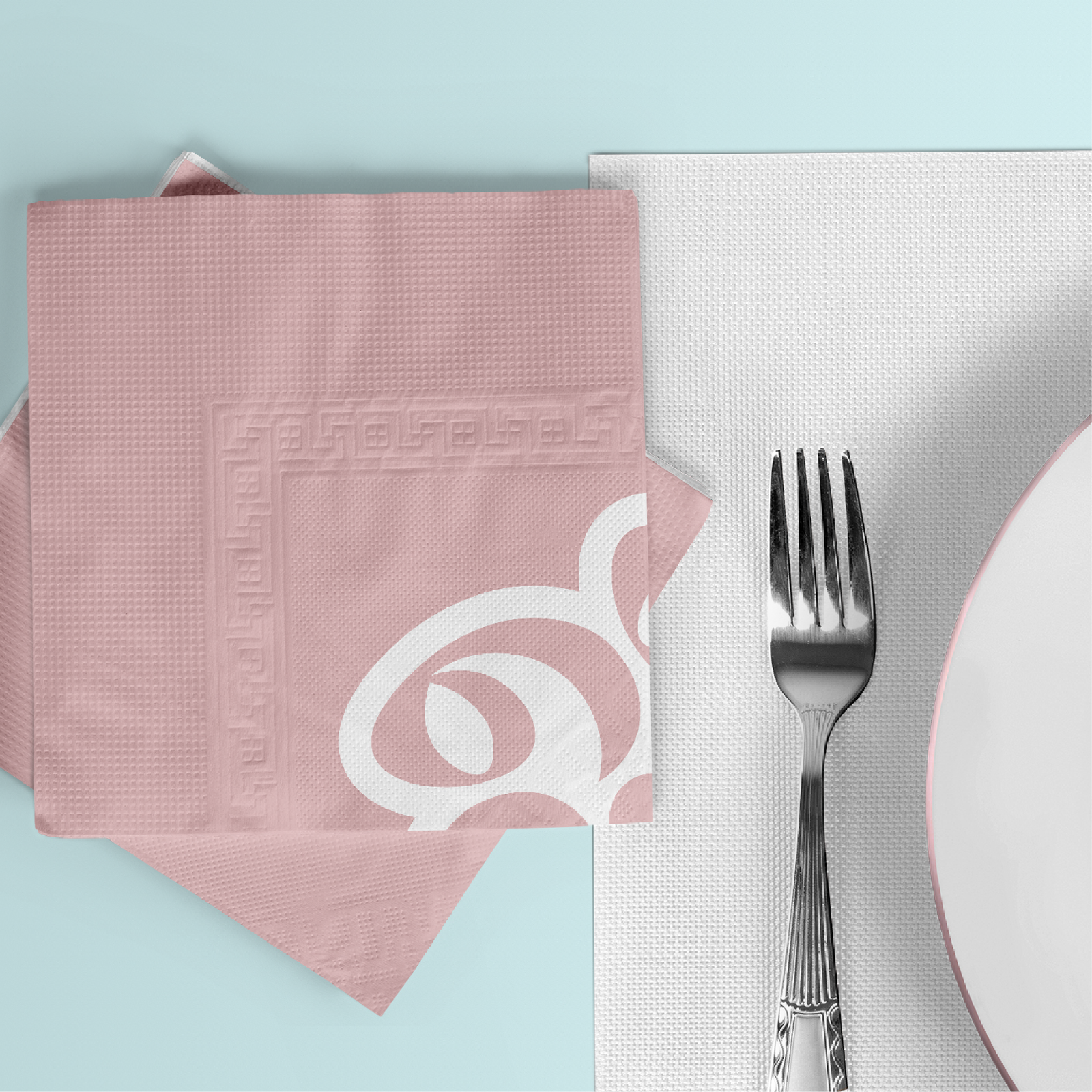
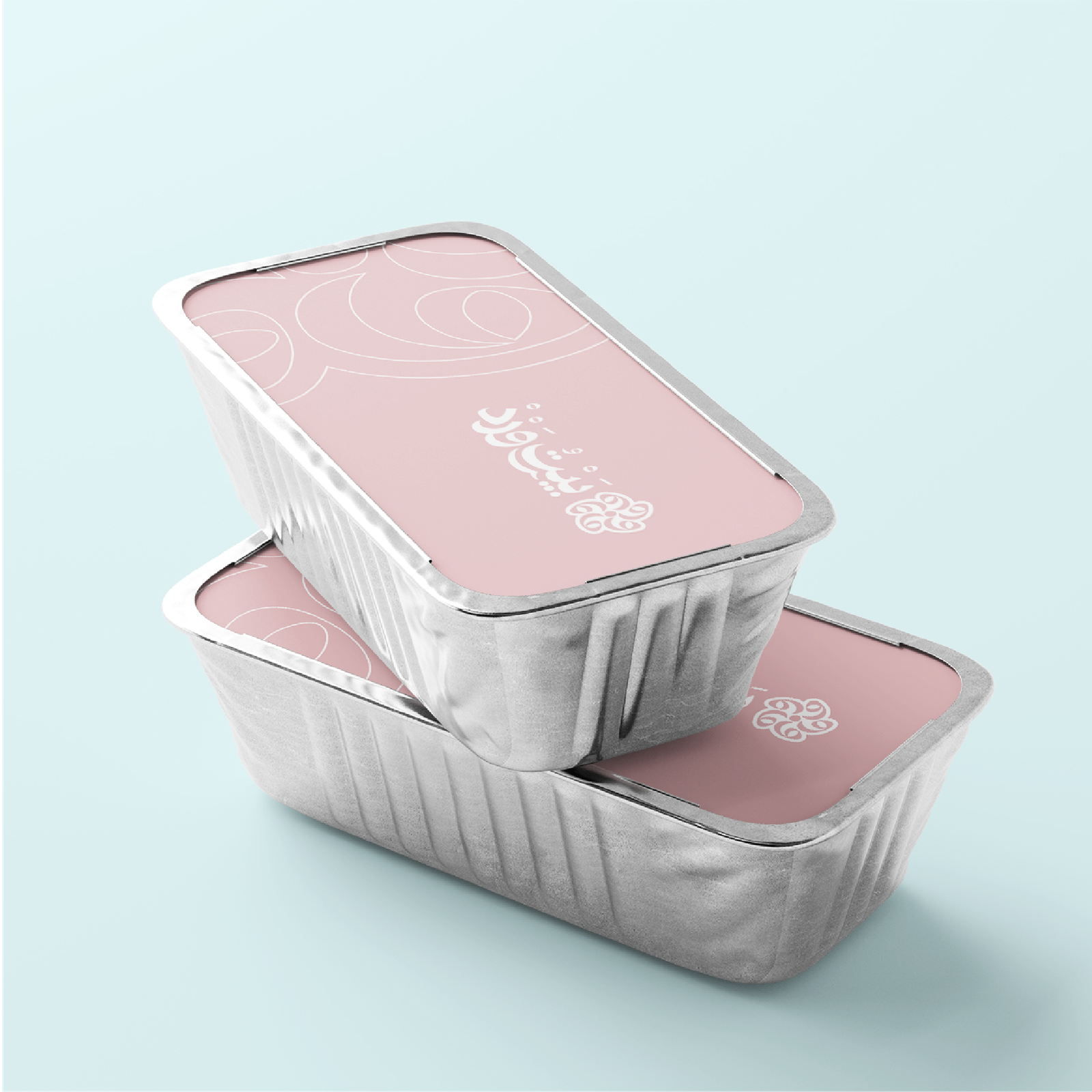
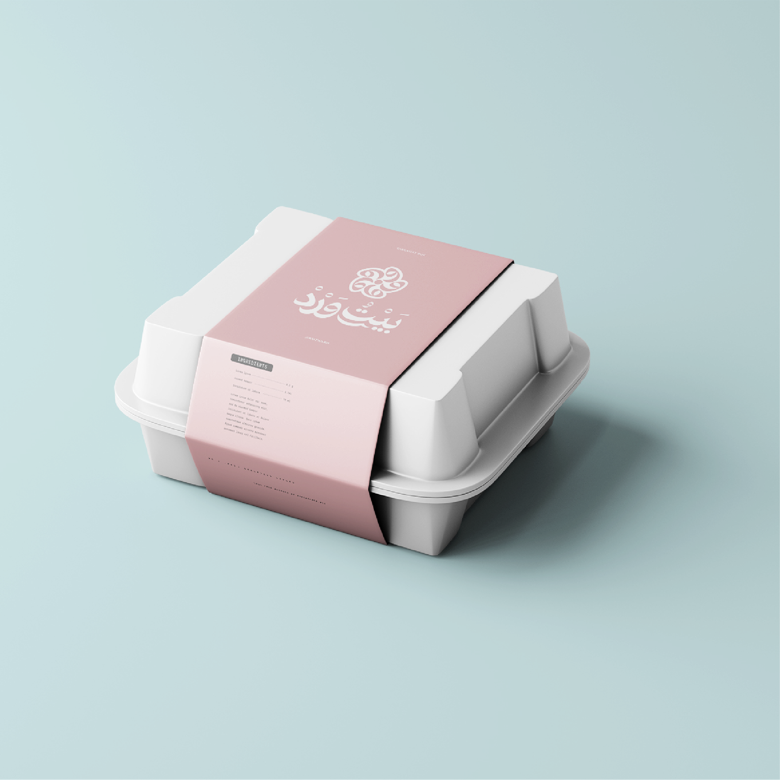
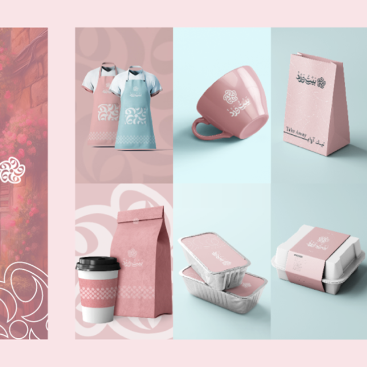
Designing visual elements such as bags, cups, and plates.
Using recurring patterns and shapes associated with roses.and shapes associated with roses.
And the day came when the risk to remain tight in a bud was more painful than the risk it took to blossom.– BILLI REUSS
05. Uniform:
Modern and comfortable attire for staff, featuring the logo and combining elegance with functionality.
The uniforms will use the brand’s primary colors .
03. FinalyThe Website


