JETEX
SOFTWARE: PhotoShop, Illustrator
SERVICES: Design
WEBSITE: jatax.com
01. Introduction:
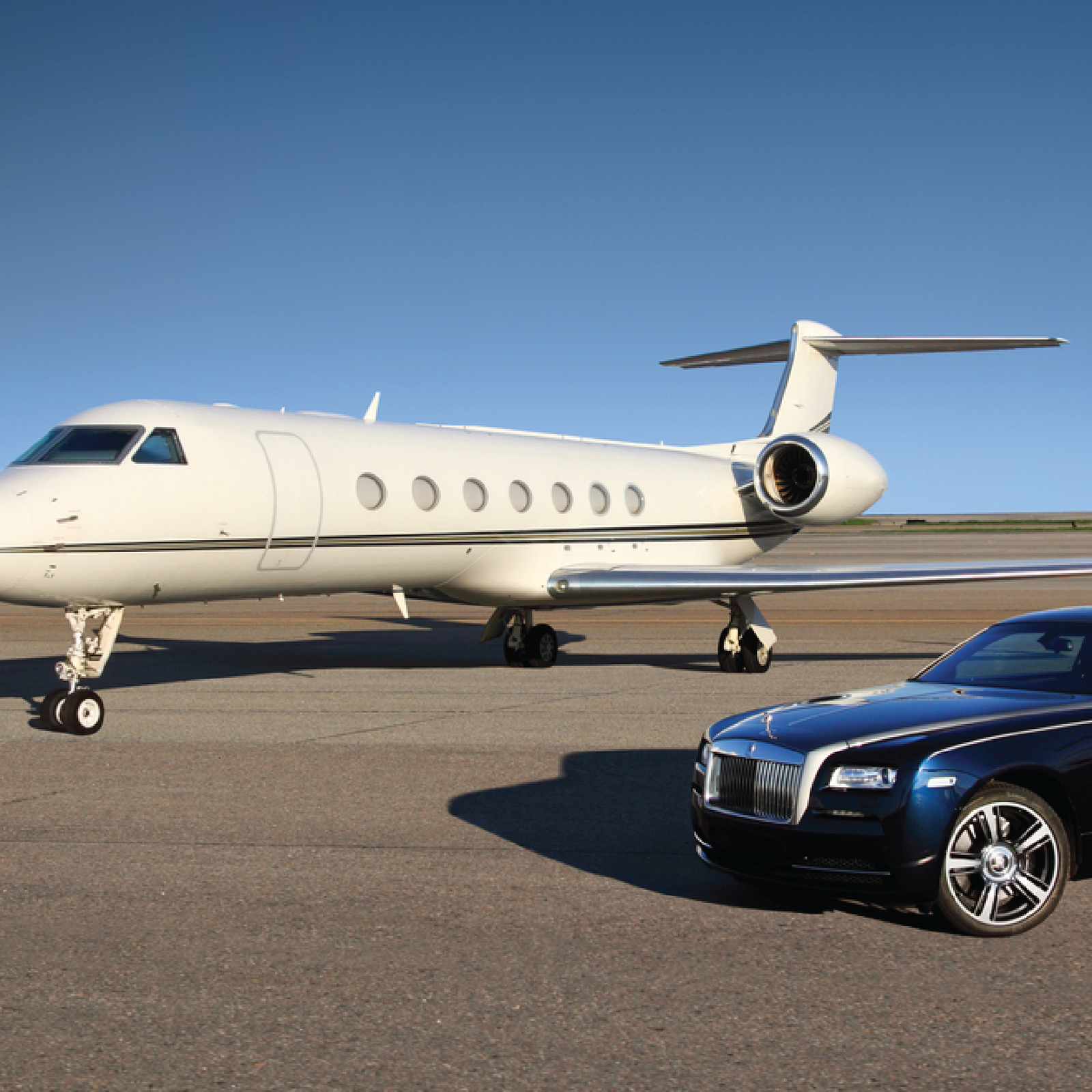
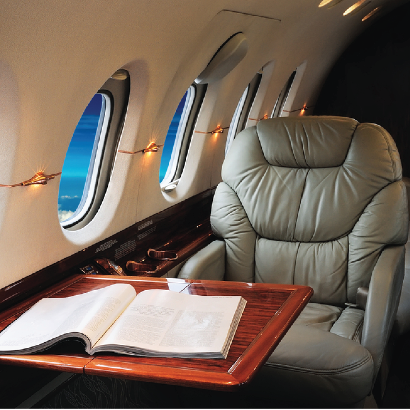
It is a global leader in private aviation, offering integrated solutions to support aviation operations through a wide network of diverse services. The company relies on a distinctive visual identity that focuses on bold colors and a simple logo to reflect its modern and dynamic character. By using orange, which symbolizes energy and innovation, and dark blue, which conveys professionalism and reliability, the company aims to highlight its status as a trusted and prestigious provider of superior services to clients worldwide.
Modern and Simple Design
The design is based on modernity and simplicity, giving an impression of cleanliness and organization, which aligns with the professional and precise environment of aviation companies. The simplicity of the logo and colors makes the identity clearer and more memorable
02. Orange Color
The choice of orange is not random. This color represents creativity, energy, and warmth, giving the company a friendly and appealing character. Additionally, orange easily stands out in busy airports or outdoor advertisements, enhancing quick recognition of the brand.
03. Repetition to Strengthen Identity
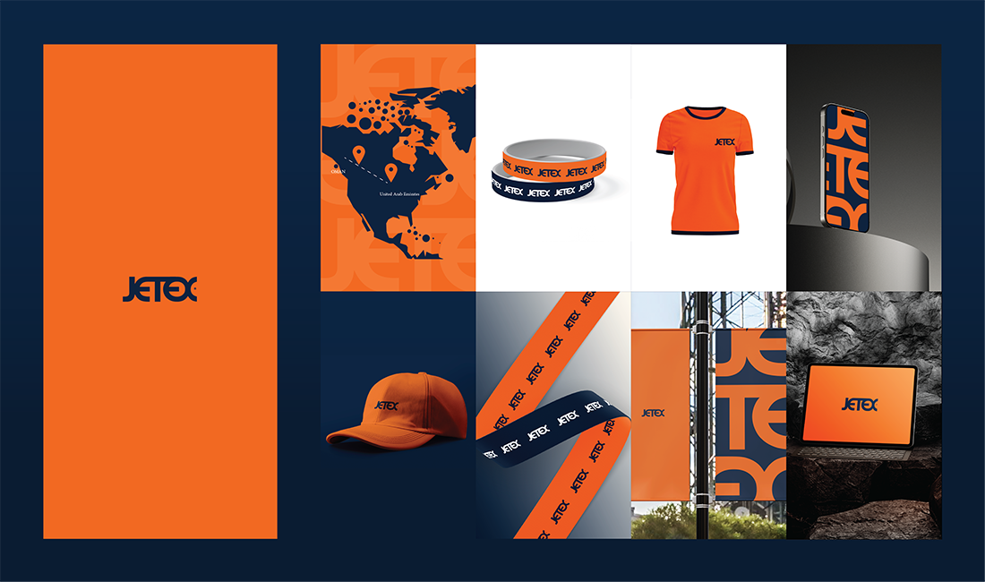
By using the company logo and the colors orange and blue across all products, from shirts to lanyards and even maps, the company demonstrates its commitment to design consistency across all customer touchpoints. This visual repetition helps solidify the brand in the customer’s mind.
04. Visual and Global Communication:
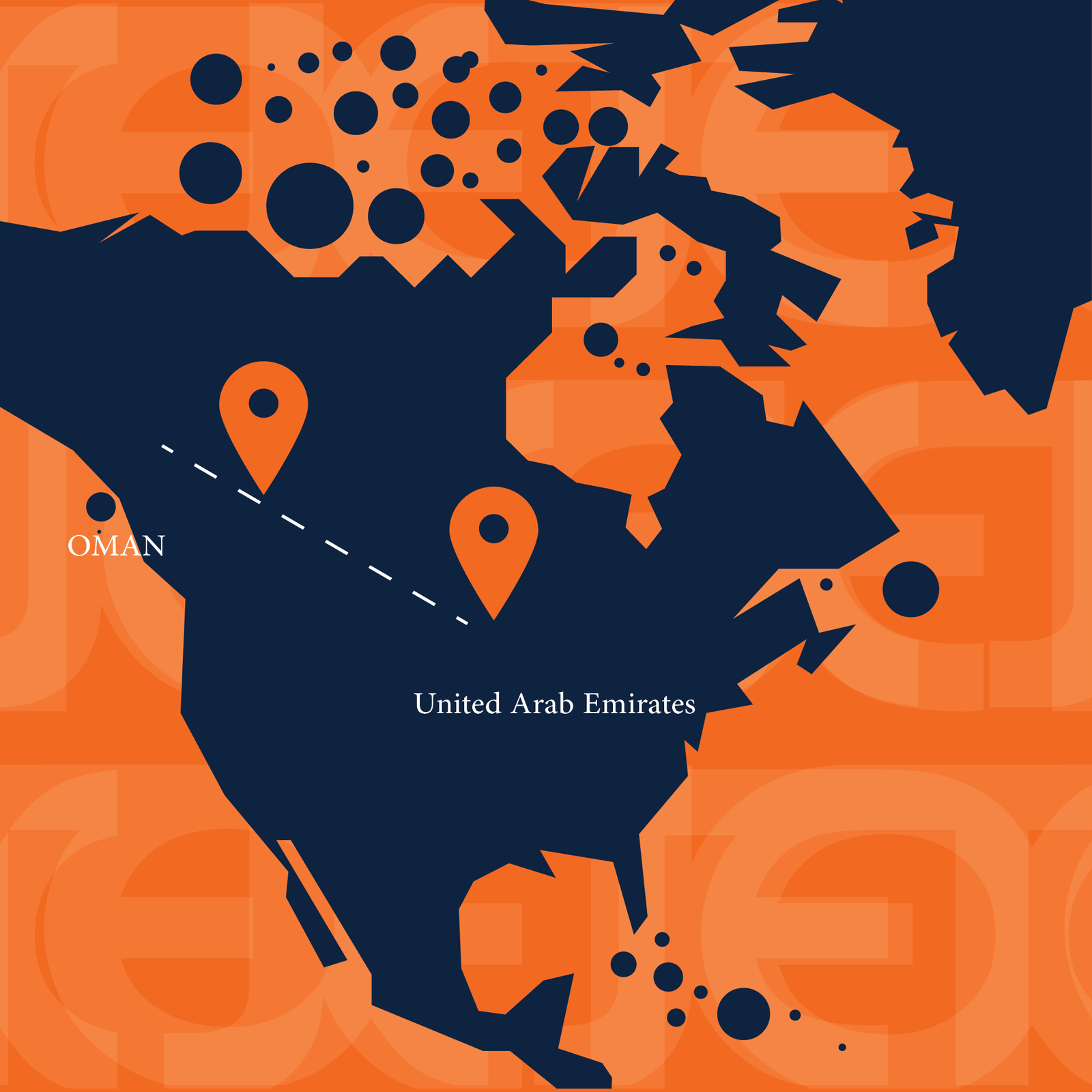
The presence of a map in the background showcasing the company’s presence worldwide enhances its global image and conveys the impression that the company is not just a local entity but a significant international player in the aviation industry. The specific points marked on the map may represent operational hubs or destinations served by the company, thereby improving the audience’s understanding of the company’s scope of operations.
05. Diverse Promotional Products
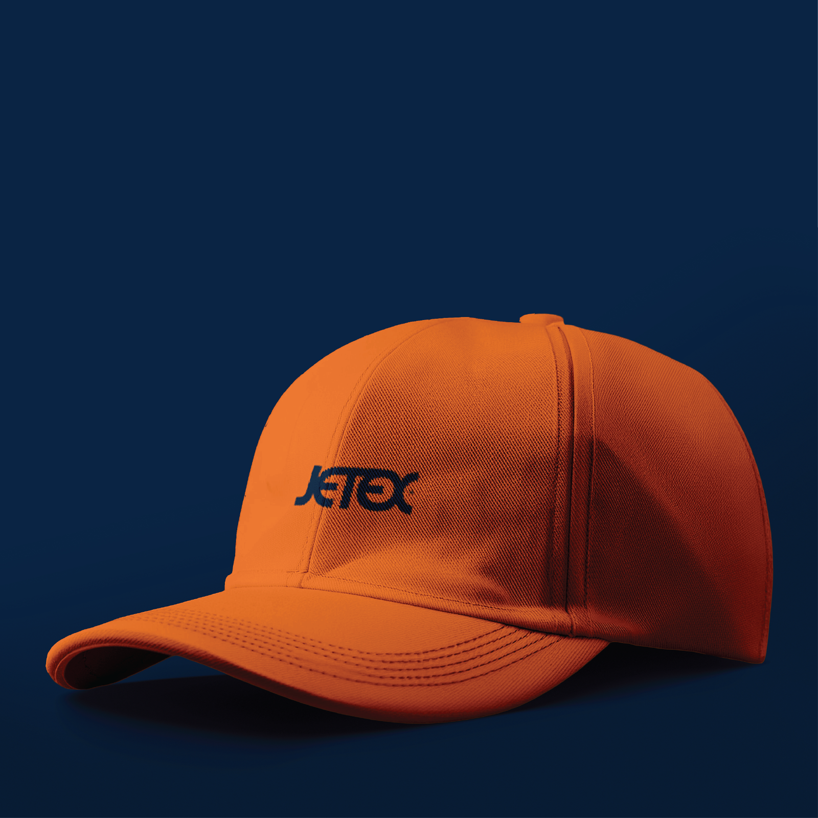
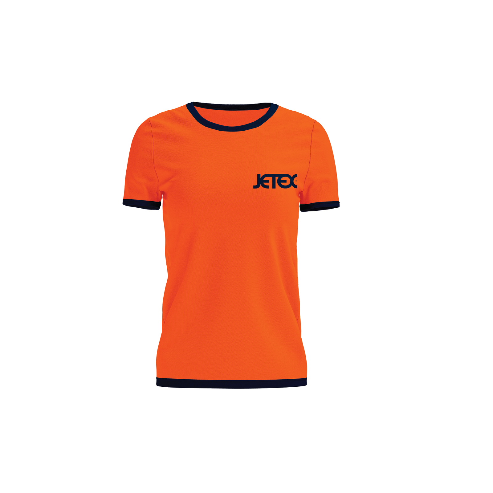
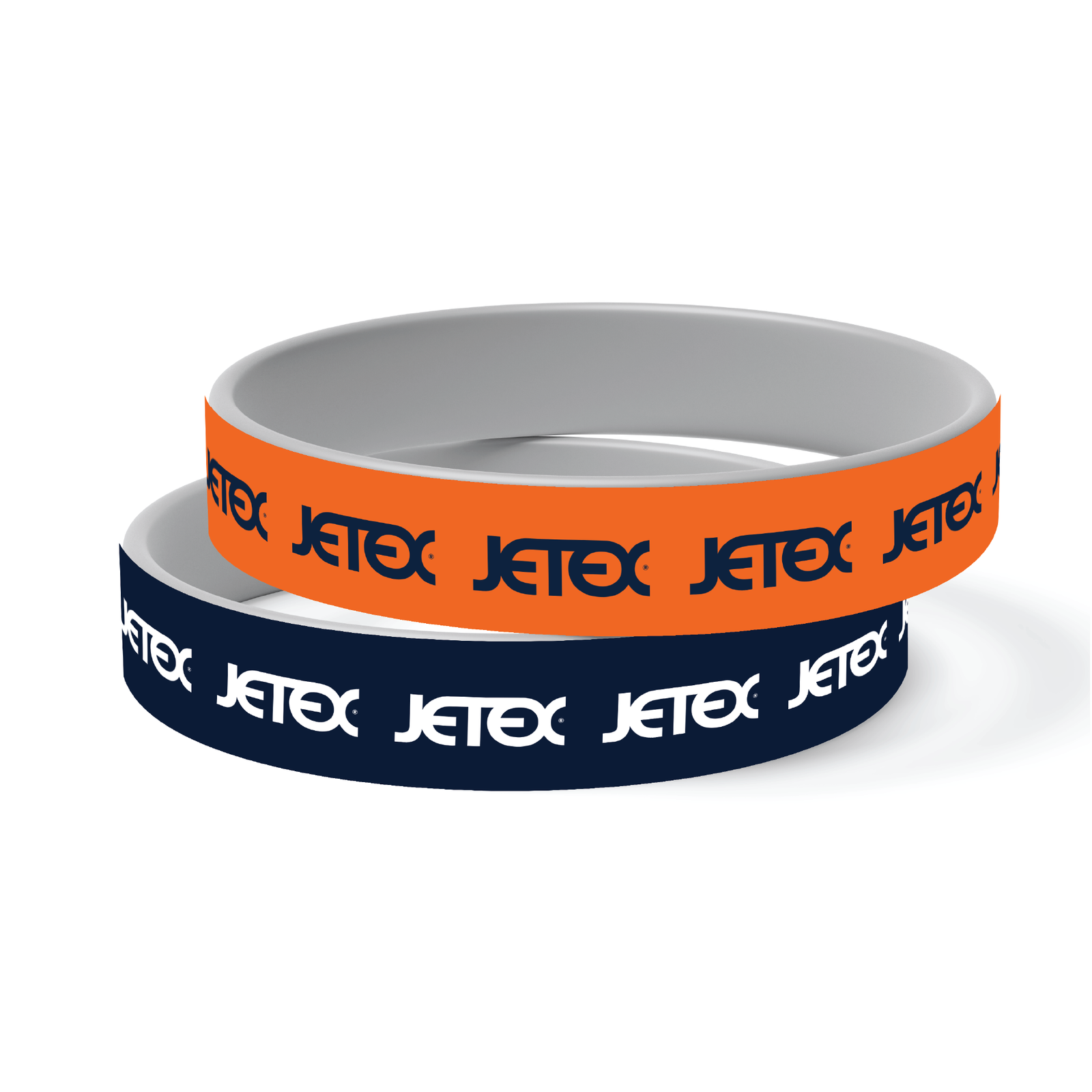
The use of products such as bracelets, hats, and t-shirts as part of the brand identity reflects the company’s investment in interactive marketing. These items can serve as tools for engaging with the audience at exhibitions and events, or even as gifts for potential clients, thereby enhancing the company’s positive impression and increasing its visibility.
06. Applying Identity on Digital Media
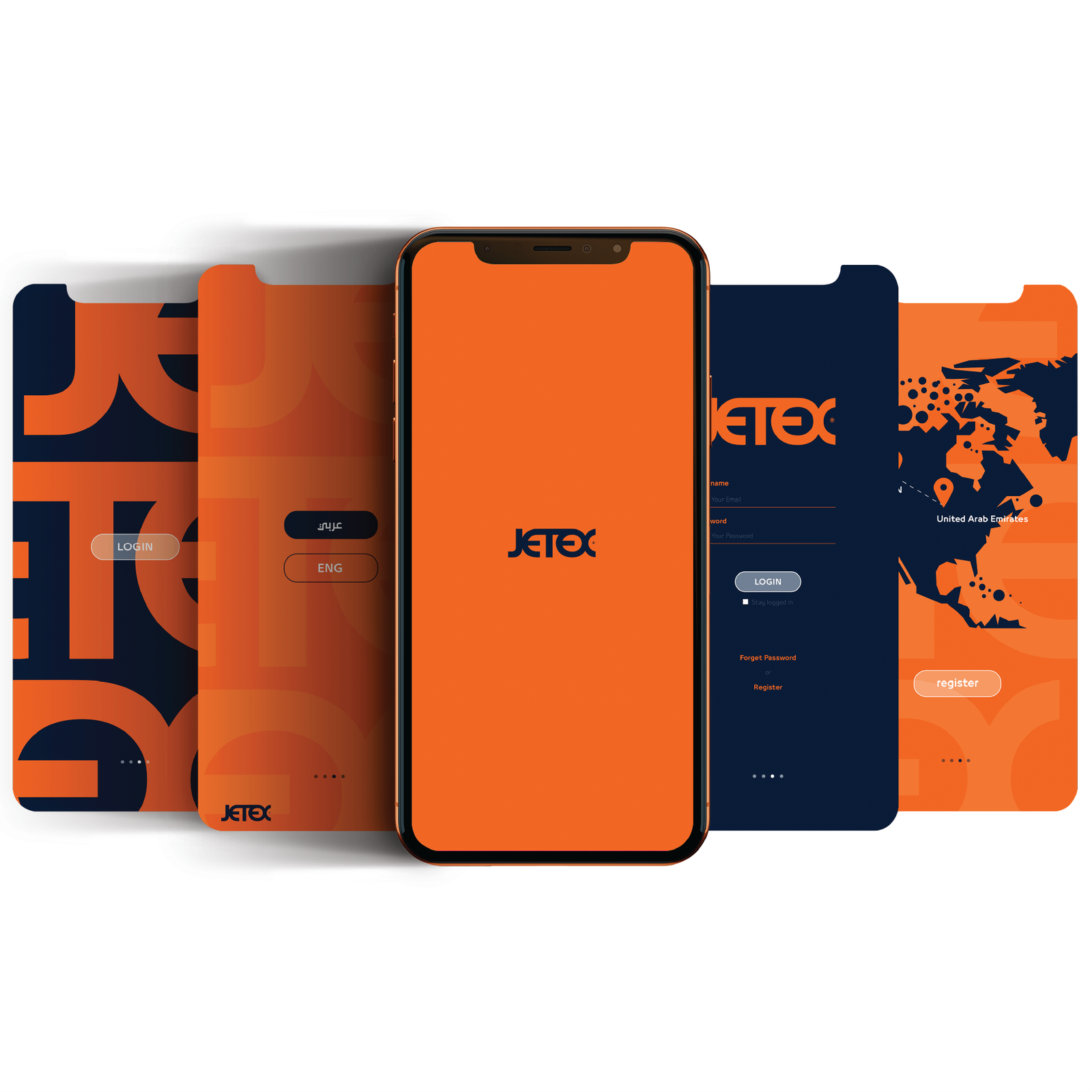
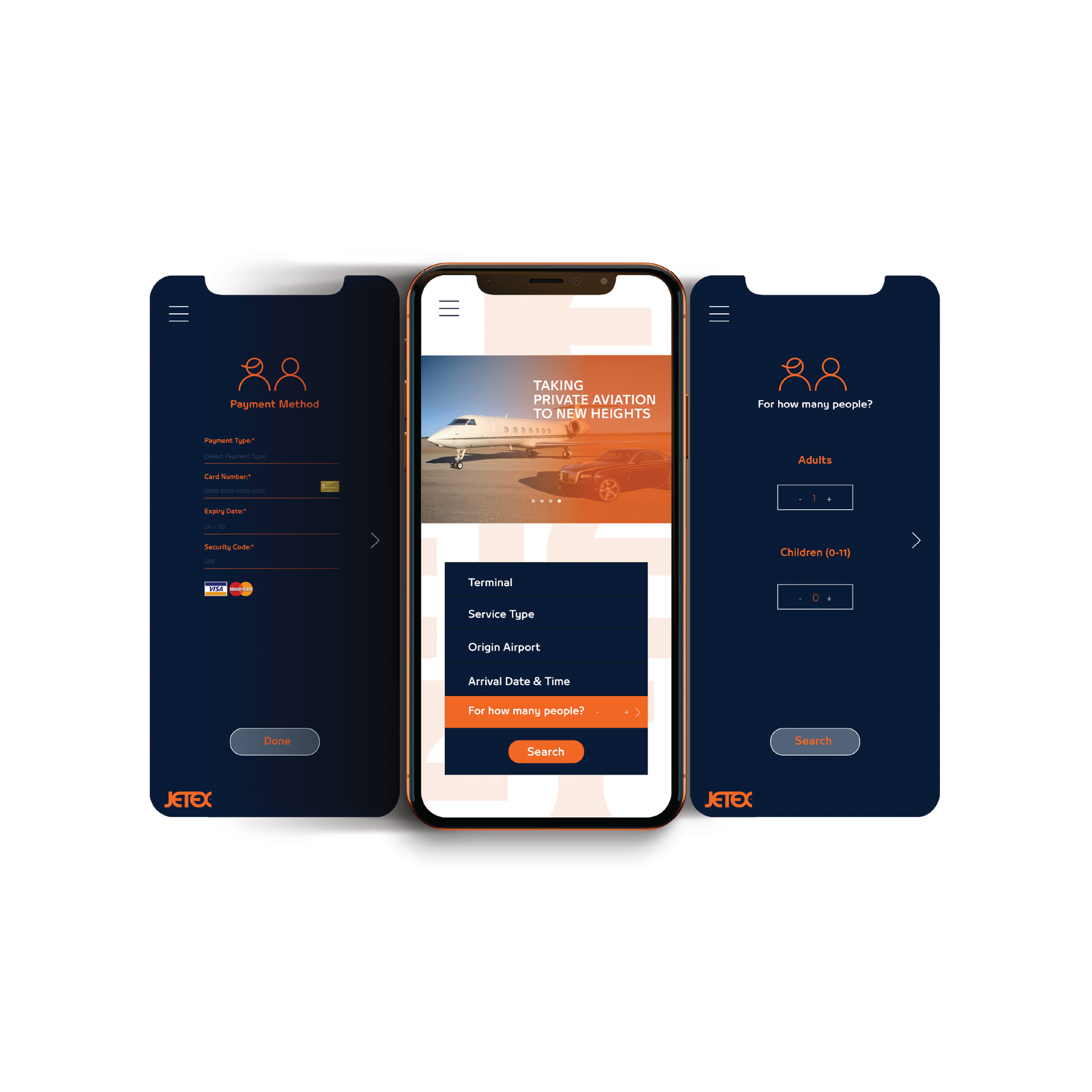
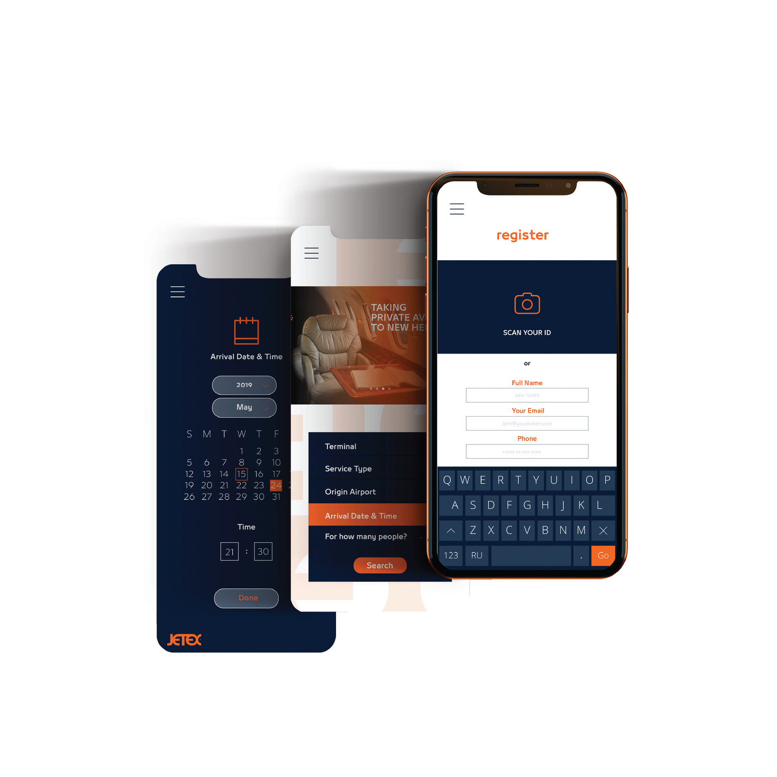
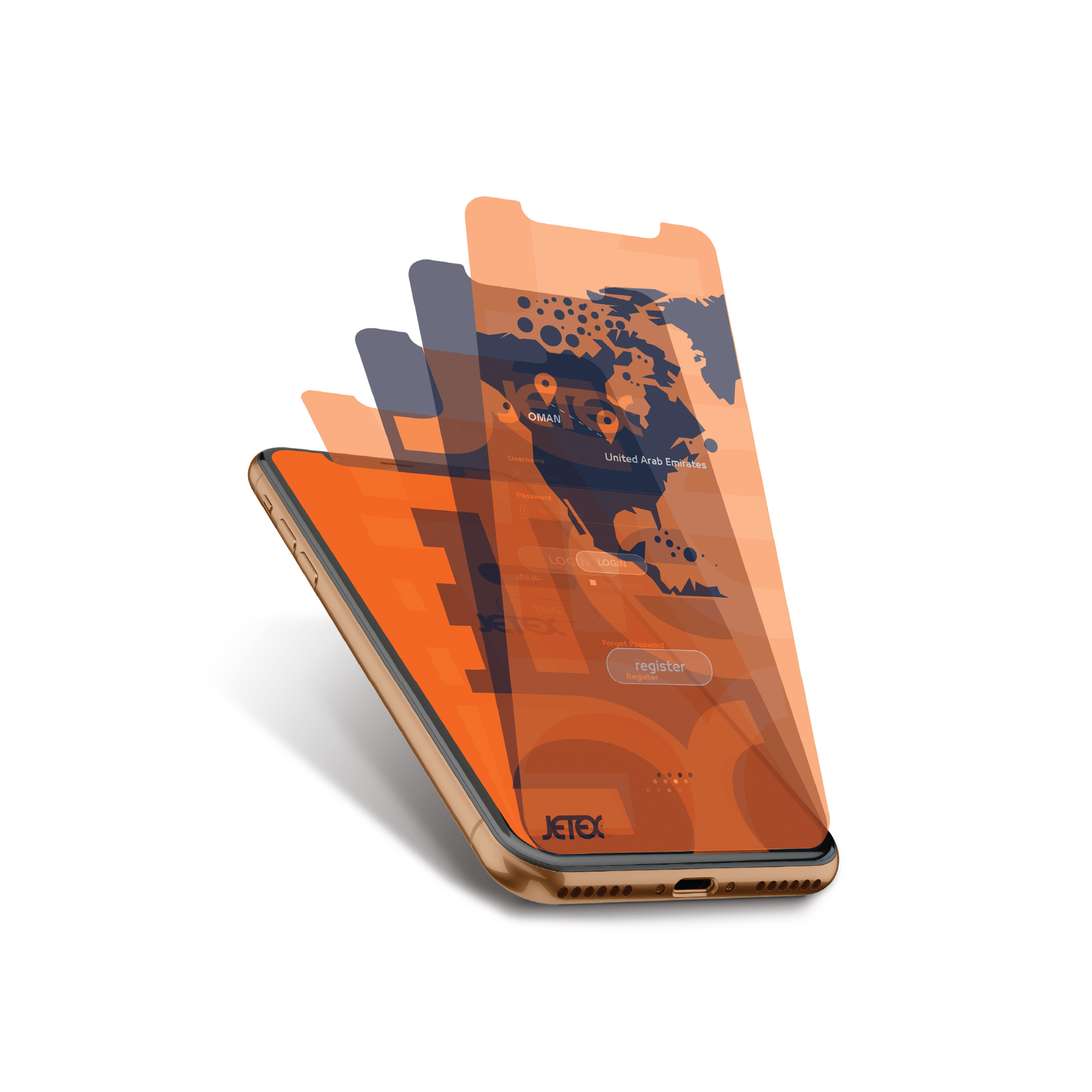
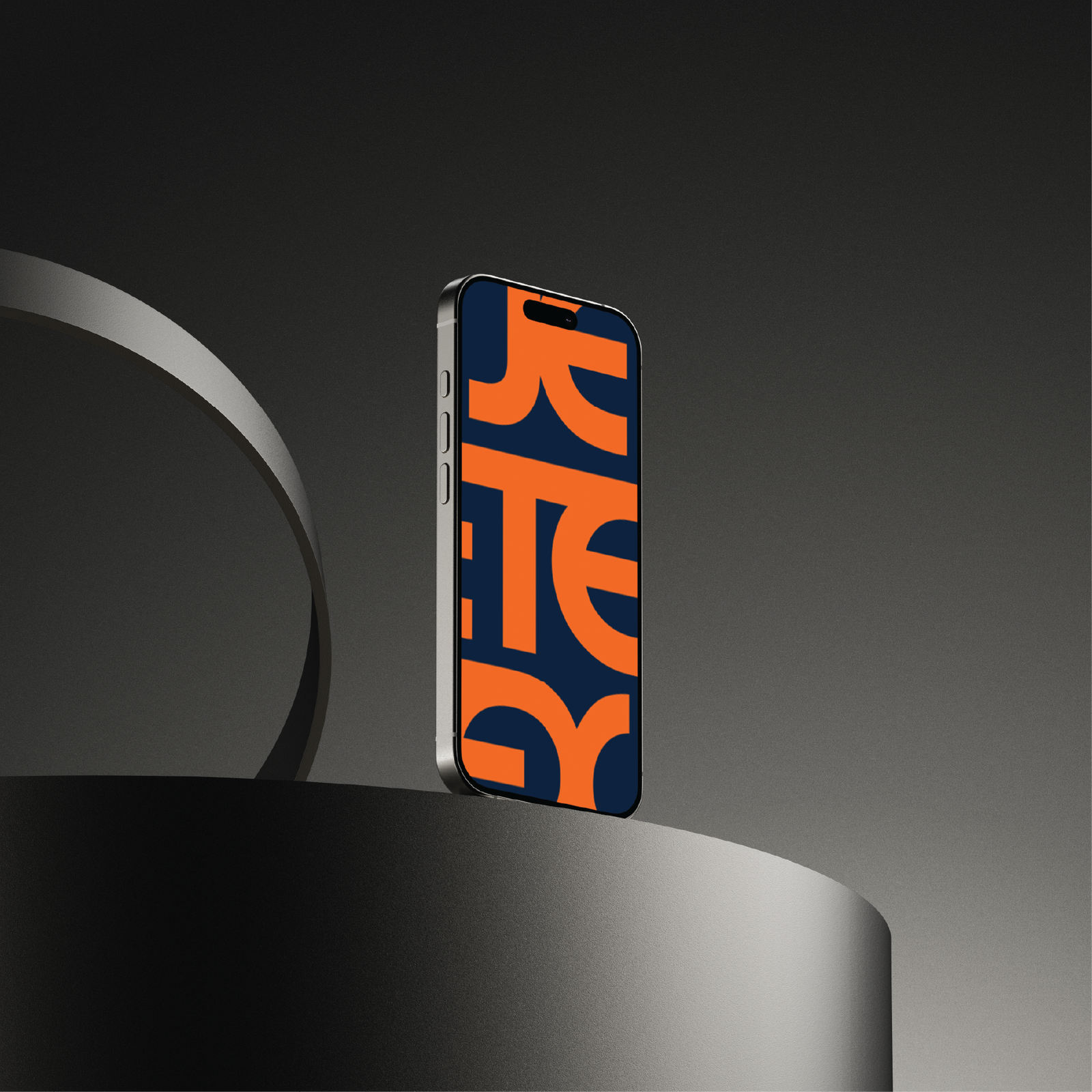
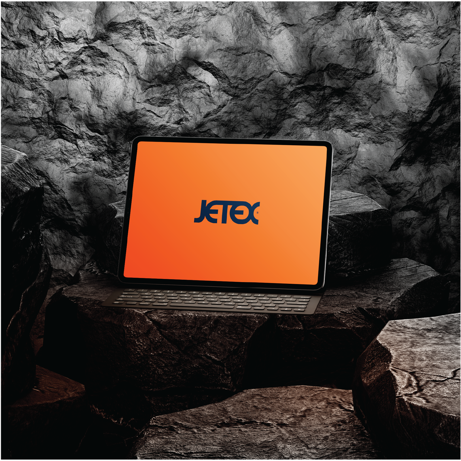
In addition to tangible applications, the company has integrated its identity into digital media such as screens and tablets. This demonstrates the company’s awareness of the importance of digital presence and its commitment to applying its identity cohesively across all platforms, whether physical or virtual.
07. Advertising Strategy and Outdoor Marketing
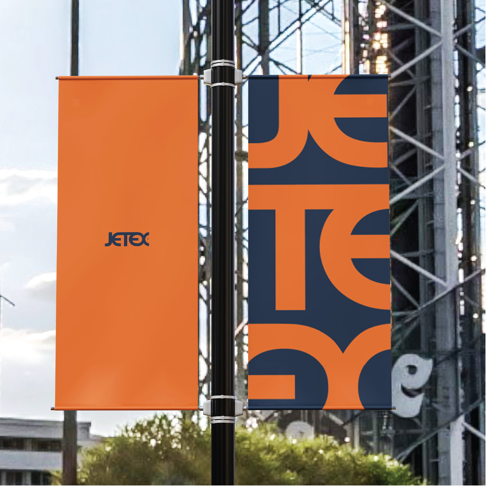
The outdoor signage prominently features the visual identity, indicating that the external advertising strategy is a fundamental part of the company’s marketing approach. Whether in airports or along roadways, the reliance on bold orange and the simple logo easily attracts attention.
08. Strong Logo and Visual Signifiers
The logo appears to be carefully designed, featuring bold, curved lines that may symbolize fluidity and movement qualities closely associated with the aviation sector. This logo is versatile and can be applied across all platforms, whether printed or digital, without losing its clarity or appeal.
09. Core Visual Identity Elements
Primary Colors
Orange: The dominant color, representing vitality, energy, and optimism.
Dark Blue: Symbolizes trust, professionalism, and reliability making it the perfect complement to orange.
Logo:
The logo consists of a wordmark with a simple yet bold design, featuring both straight and curved lines that convey movement and fluidity, reflecting the aviation industry. The interconnected letters symbolize communication and connectivity.
10. Promotional Items
T-Shirts: A simple orange shirt featuring the company logo, fostering team spirit and unifying employees.
Hats: An orange sports cap with the logo, used for promotions or as part of the employees’ uniforms.
Rubber Bracelets: Available in two colors (orange and blue), these bracelets carry the company logo and are used as promotional gifts.
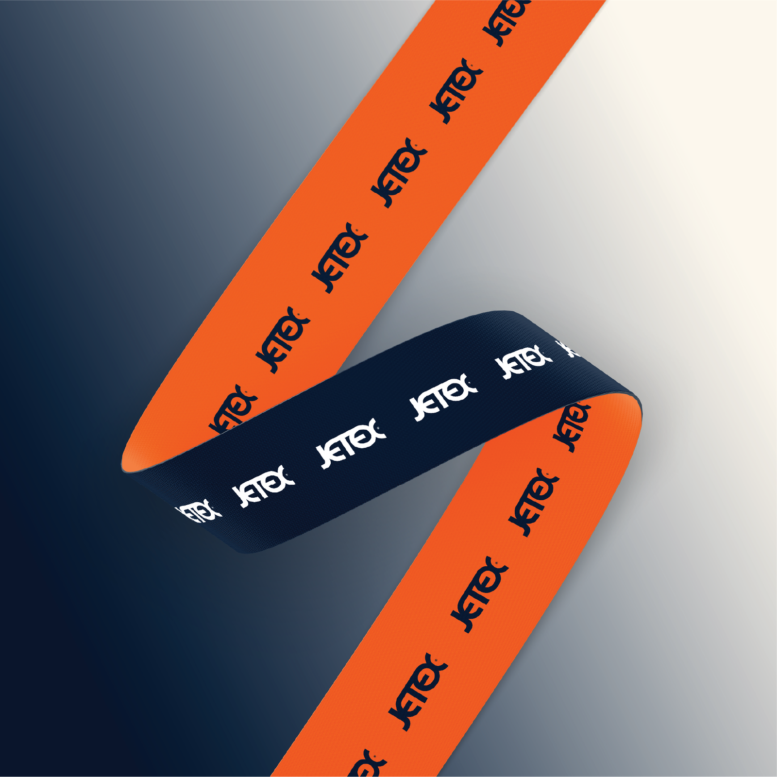
Lanyards: Lanyards used at conferences and events, prominently displaying the brand.
Digital Applications:
The visual identity extends to screens and tablets, where the logo and colors are prominently displayed, enhancing the company’s digital presence.
11. Outdoor Advertisements
The visual identity is showcased in signage and outdoor advertisements, whether on billboards along roads or at events and airports, thereby increasing brand visibility to the public.
Maps:
The use of a world map to display the locations of the company s offices or services, with marked points highlighting its global presence, enhances the company’s image as an international entity.
Packaging and Marketing Materials:
The visual identity is utilized in the design of boxes, official documents, and other marketing materials, relying on orange colors and the logo to create consistency in the customer experience.
Packaging and Marketing Materials:
The visual identity is utilized in the design of boxes, official documents, and other marketing materials, relying on orange colors and the logo to create consistency in the customer experience.


